

A room can look tired long before anything in it actually breaks. Walls that feel too dark, too plain, or completely disconnected from the furniture make even a well-kept space seem outdated. The right interior house painting ideas can fix that, because color, finish, pattern, and a well-placed accent all change how a room looks and how it feels to spend time in.
Good interior painting is about more than picking whatever shade is popular this year. Lighting, room size, furniture, existing decor, and personal style all decide whether a color works. The sections below walk through practical ideas for different rooms, ways to combine colors, and creative techniques, so you can turn a general wish for a fresh look into a clear plan.
How to Start Planning Interior House Painting Ideas
Before you look at swatches, get clear on what the room needs. A good plan turns home interior painting ideas into decisions about mood, light, focal points, and scope, and it keeps your choices consistent with your overall interior design.
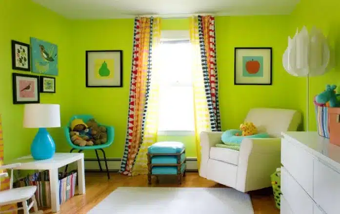
Identify the Mood You Want the Room to Create
Decide whether the room should feel calm, bright, cozy, energetic, elegant, modern, or welcoming. A home office may need a focused, steady tone, while a family room might call for something warmer and more relaxed. Naming the mood first gives you a filter for every paint idea that follows.
Consider Existing Furniture Before Choosing Colors
Sofas, flooring, curtains, artwork, and rugs already carry color, and your walls need to work with them. A gray-toned sofa and warm oak floors, for example, point toward different wall colors than a white sofa on pale flooring. Treat the items you are keeping as fixed and let the paint respond to them.
Study Natural and Artificial Light Throughout the Day
The same paint can look crisp in the morning and muddy by evening. Window direction, bulb type, and nearby surfaces all shift how a color reads. Check the room at several times of day, with the lights on and off, before you decide anything.
Decide Which Walls Deserve Extra Attention
Not every wall needs to be a feature. Look for natural focal points such as a fireplace, built-in shelving, a large window, or an architectural detail, and consider giving those areas more visual weight than the rest of the room.
Create a Simple Plan Before Buying Paint
Write down the colors you are considering, the finish for each surface, which walls or trim will be painted, and how many samples you want to test. A rough budget belongs in the plan too, and looking at the cost to paint a house of similar size gives you a realistic range before you commit to finishes. Having this on paper prevents mismatched choices once you are standing in the paint aisle.
How to Build a Cohesive Interior Color Palette
Individual rooms can have their own personality and still feel like part of one home. The goal with interior color combinations is flow, so that walking from one space to the next feels intentional. This works best when you think about interior colors, wall colors, and house colors as one system instead of room-by-room decisions.
Start With One Color You Already Love
A favorite rug, a piece of art, or a fabric you never get tired of can anchor the whole palette. Pull one shade from it and build outward with lighter and deeper versions. This approach also helps when you choose paint colors for a home you plan to keep for many years, since a color you already love is less likely to feel dated.
Balance Neutral Shades With Stronger Accent Colors
Neutrals give the palette a calm, flexible base, and a few stronger shades add character where you want it. Keep the bold color to a smaller share of the space, such as one wall, a door, or a built-in, so it reads as a deliberate choice.
Connect Adjacent Rooms With Repeated Color Notes
Rooms that open onto each other do not need identical walls. Repeating a subtle tone, like the same soft green in a hallway and a nearby bedroom, creates continuity while leaving room for variety.
Combine Warm and Cool Tones With More Control
Every paint color has an undertone, and mixing warm and cool shades without noticing them is what makes combinations look accidental. Compare samples side by side and check whether they lean yellow, pink, blue, or green. When the undertones are chosen on purpose, warm and cool tones can balance each other nicely.
Use the Three-Color Rule for Simple Coordination
A simple structure is one dominant color for most walls, one supporting color for secondary areas or trim, and one accent for small moments. This keeps combinations easy to organize and stops a palette from growing out of control.
Creative Living Room Painting Ideas That Stand Out
The living room is usually the main gathering space, so it rewards a little creativity. These living room painting ideas go beyond painting every wall the same color, and they work with your paint colors and interior colors instead of fighting them.
Create an Accent Wall Around a Natural Focal Point
Fireplaces, media walls, large windows, and seating areas already draw the eye. Placing an accent wall there reinforces what people naturally look at, while an accent on a random wall can feel arbitrary.
Try Two-Tone Walls for More Visual Structure
Splitting a wall into two complementary colors, with the deeper shade below and the lighter one above, adds depth without complicated artwork. A clean dividing line at a consistent height keeps the look tidy.
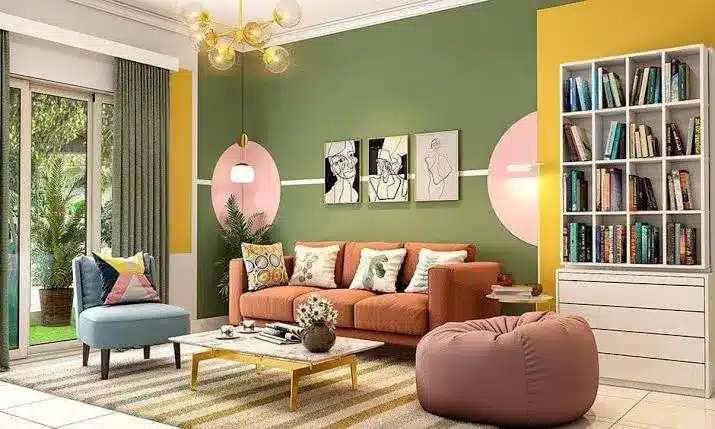
Use Geometric Shapes for a Modern Statement
Painter’s tape makes geometric designs achievable for most homeowners. ScotchBlue shows how taped lines, zigzags, and shapes can add visual interest through paint alone. Keep the shapes simple and the palette limited so the wall stays a feature and does not turn into a pattern that competes with everything else.
Bring the Ceiling Into the Living Room Palette
A ceiling does not have to default to bright white. A softly tinted ceiling that relates to the wall color can make the room feel more finished and intentional. Lighter tints of the wall color are the safest starting point.
Match Living Room Colors With the Decor
Rugs, curtains, furniture, and accessories help you judge whether a bold or subtle palette suits the space. A room full of patterned textiles usually needs quieter walls, while a simple, neutral room can carry a stronger color.
Bedroom Paint Ideas for a Calmer, Softer Feel
A bedroom should help you wind down, but “calm” does not have to mean bland. These bedroom paint ideas connect color intensity, lighting, and furniture to the mood you want. They also point toward popular interior paint colors and interior wall color ideas that suit sleeping spaces.
Choose Soft Colors for a Relaxed Bedroom Atmosphere
Muted, softer shades create a quieter visual environment. Gentle greens, warm grays, and pale blues are common choices, and adding a little depth to the shade keeps the room from feeling flat or washed out.
Use Deeper Colors to Create a Cozy Bedroom
Darker shades can make a bedroom feel warm and enclosed in a good way. Using them on selected bedroom walls, rather than every surface, gives you the cozy effect while keeping the room from feeling heavy.
Build a Bedroom Palette Around Bedding and Textiles
Bedding, curtains, rugs, and upholstered furniture take up a lot of visual space in a bedroom. Choose the textiles you love first, then pick wall colors that sit comfortably beside them.
Add an Accent Wall Behind the Bed
The wall behind the headboard is a natural focal point because it is the first thing you see when you walk in. Choose a color that is a step or two deeper than the other walls so the effect is noticeable without overwhelming the room.
Consider the Ceiling When Designing Bedroom Walls
You spend a lot of time looking up in a bedroom, so the ceiling matters more than in most rooms. A subtle tint that complements the walls creates a more complete color scheme and can make the whole room feel wrapped in one idea.
Modern Wall Painting Ideas for More Visual Interest
If a single flat color feels too plain, modern painting techniques can give walls more character. These modern interior paint ideas are among the creative interior painting ideas that remain practical for everyday homes, and each one changes how wall colors work in a room.
Use Color Blocking to Divide Large Wall Areas
Two or more carefully chosen colors can organize a large wall or mark separate zones, such as a reading corner or a workspace. Keep the colors related so the blocks feel planned.
Create Simple Stripes for a Structured Look
Horizontal stripes tend to widen a room, and vertical stripes can make ceilings feel taller. Proportion matters, so measure the stripes carefully and choose colors close enough in tone that the effect stays refined.
Experiment With Painted Arches and Curved Shapes
A painted arch can frame a bed, a desk, or a piece of art without any structural work. Curves soften a room full of straight lines and give a plain wall a clear focal point.
Layer More Than Two Colors for Added Depth
ScotchBlue points out that you can use multiple colors by repeating the tape-and-paint process to build more complex designs. Let each layer dry fully before taping over it, and limit yourself to colors that share an undertone.
Highlight Trim and Architectural Details With Paint
Trim, molding, wainscoting, doors, and built-ins can all become part of the color design. Painting them a shade different from the walls, whether deeper or slightly lighter, highlights good architecture and adds definition.
How to Use Paint Techniques Without Overdoing Them
Creative techniques work best with restraint. Too many painted features can compete with your furniture and make a room feel busy. Balancing creative interior painting ideas with simpler surroundings keeps paint ideas and color combinations working together.
Choose One Main Statement Feature Per Room
A single strong treatment, whether stripes, an arch, or a bold wall, gives the eye somewhere to land. Adding a second or third statement in the same room usually dilutes all of them.
Keep Bold Patterns Away From Competing Focal Points
If a fireplace, large artwork, or heavily patterned curtains already anchor a wall, adding a painted design there creates visual noise. Place the pattern on a wall that has less going on.
Repeat Accent Colors Across Nearby Spaces
Repeating a bold shade in smaller details, like a pillow, a frame, or a painted door in the next room, ties a statement wall to the rest of the interior.
Test Decorative Techniques Before Committing Fully
A small test area shows whether a pattern, layered color, or specialty finish looks the way you imagined. A few wall painting tricks also help, such as pressing tape edges flat and cutting in carefully, so the finished lines look crisp.
Balance Creative Walls With Simpler Surroundings
Neutral walls, restrained furniture, and controlled decor let one painted feature stand out. The simpler everything else is, the more confident the creative wall looks.
How Paint Colors Can Make an Interior Feel Larger
Color changes how big a room feels. Interior wall color ideas for small spaces usually rely on light, low-contrast palettes, and the right interior colors can make a room feel more open without moving a wall. Light paint colors such as soft whites, pale grays, and gentle creams reflect more light, which makes walls appear to recede.
Visual continuity helps as well. When the walls, trim, and ceiling sit close together in tone, the eye reads fewer boundaries and the space feels more open. Strong contrast, by comparison, breaks a room into sections and can make it feel smaller.
A few practical points make this easier to apply:
- Choose lighter paint colors for small or dim rooms.
- Keep the ceiling the same shade as the walls, or one step lighter.
- Paint trim close to the wall color instead of using a sharp contrast.
- Use a broader accent on one wall for depth without closing in the space.
How to Match Interior Wall Colors With Home Decor
A wall color that looks great on a swatch can clash with what is already in the room. Matching wall colors to your home decor means looking at flooring, fabrics, furniture, artwork, and fixtures as a group, then choosing color combinations that support all of them. Good interior design starts with what is already there.
Flooring often has the strongest influence because it covers the largest surface and rarely changes. Notice whether it leans warm or cool, and choose wall colors with a compatible undertone. Fabrics and artwork come next, since they can suggest a supporting shade or a color to echo in one accent wall.
Bold furniture pieces, such as a deep green sofa or a bright statement chair, usually look best against quieter walls. Let the furniture carry the color and keep the wall supportive. Metal finishes on lighting and hardware matter too, because warm brass and cool chrome each pair better with certain undertones.
When you compare a paint sample to your decor, hold it next to the actual floor, fabric, and furniture instead of judging it alone. Look at it in the room’s real light. If it feels harmonious there, it is usually a good match.
Choosing Interior Paint Colors Around Natural Light
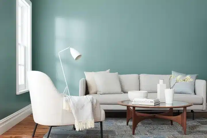
Natural light changes color more than most people expect. Even popular interior paint colors can shift dramatically from one room to another, so it helps to think about how each room is lit before you settle on interior colors.
Bright rooms can handle deeper and cooler paint colors, while darker rooms tend to look better in warmer, lighter shades that make the most of what light they have. North-facing rooms often get cooler, softer light, and south-facing rooms tend to be warmer and brighter through the day. Artificial lighting matters too, since warm bulbs bring out yellow undertones and cooler bulbs can make the same paint look grayer or bluer.
To judge a color fairly, look at it in the morning, at midday, and in the evening. Watch how the undertone changes, and check it under the bulbs you use most.
Common Interior House Painting Mistakes to Avoid
Even strong interior house painting ideas fall short when the planning or preparation is weak. These are the mistakes that cause the most regret with paint ideas, wall colors, and color combinations:
- Skipping samples. A small chip cannot show how a color behaves across a whole wall. Test larger samples in the actual room.
- Ignoring undertones. A gray that looks neutral in the store can read blue or purple at home. Check how it looks next to your flooring and fabrics.
- Using too many colors. A room with several competing shades feels chaotic. Stick to a simple structure such as one main color, one supporting color, and one accent.
- Choosing the wrong finish. Glossier finishes show wall flaws and suit trim and doors better, while flatter finishes hide imperfections on walls. Match the finish to the surface and the room.
- Rushing preparation. Dirty walls, unfilled holes, and missing primer where needed lead to uneven results, no matter how good the color is.
- Forgetting the ceiling and trim. Leaving them out of the plan can make an otherwise good color scheme feel unfinished.
How to Test Interior Paint Colors Before Painting
Testing is the most reliable way to avoid a color you regret. Instead of judging a tiny swatch, put samples on the actual walls and live with them for a few days. This helps you decide among interior wall color ideas and interior color combinations with real information.
Paint sample patches at least a couple of feet wide, or use large painted boards you can move around the room. Place them on more than one wall, since light hits each wall differently. Check them in the morning, afternoon, and evening, and again with lamps on.
A short checklist keeps the process organized:
- Apply samples to at least two different walls in the room.
- Look at them in morning, midday, and evening light.
- Hold them beside your flooring, furniture, and curtains.
- Check them under the bulbs you actually use.
- Wait until the samples are fully dry before you decide.
Final Thoughts on Interior House Painting Ideas
The best interior house painting ideas balance color, room function, lighting, furniture, and personal style. A palette that suits the way you live will look better and last longer than one chosen purely because it is popular. Starting with mood, light, and existing decor makes it much easier to narrow a long list of paint colors down to a few that fit.
Whether you lean toward soft bedroom shades, a bold living room feature, or subtle wall colors that connect the whole house, the strongest results come from a plan. Home interior painting ideas work best when you keep them simple, repeat a few colors thoughtfully, and let one statement feature do the heavy lifting.
Now it is time to choose the direction that feels most like your home, test your colors on the actual walls, and move forward with a well-planned interior painting project. If you would like experienced help turning your ideas into a finished result, the team at Evers Painting is ready to help.
FAQs About Interior House Painting Ideas and Colors
Choosing interior colors becomes easier when you consider the room’s lighting, size, furniture, and overall style.
These common questions cover practical color and painting decisions you may still have after exploring the ideas above.
Each answer is short and direct so you can find what you need quickly.
Soft neutrals such as warm whites, light grays, and gentle beiges are the simplest to coordinate. They work with many furniture styles and let you introduce stronger colors room by room without clashing.
They can, especially when every surface is dark and the room gets little light. Used on one wall, or paired with good lighting and lighter trim, dark colors can make a small room feel cozy and deep instead of cramped.
Flatter finishes suit ceilings and most living room and bedroom walls because they hide imperfections. Slightly shinier finishes hold up better in kitchens, bathrooms, and on trim and doors where cleaning is more frequent.
Most rooms look balanced with about three: a main wall color, a supporting shade, and one accent. Going beyond that is possible, but each extra color makes the room harder to keep cohesive.
An accent wall is the simplest option. Painting a single wall in a deeper or contrasting shade adds interest with far less effort than patterns or detailed designs.